An Excel .xlsx spreadsheet automatically+ generated the XML code for the following SVG images:
20210502 Warming stripes comparison of Global Mean Surface Temperature datasets.svg +I manually combined five automatically generated images into this one
20210507 Warming stripes - ellipses - global warming.svg
20210522 Warming stripes - longitudes - meridians on a globe - global warming.svg
20210526 Warming stripes - hearts - global warming.svg
20210507 Warming stripes - triangles - global warming.svg
20210530 Warming stripes - diamonds - global warming.svg
20210604 Warming stripes - XLSX to SVG - various Diamond etc configurations - GIF.gif
20210507 Warming stripes - rectangles - global warming.svg
20210517 Warming stripes - pentagrams - stars - global warming.svg
20210508 Warming stripes - hexagons - global warming.svg
20210507 Warming stripes - octagons - global warming.svg
The spreadsheet user can toggle a switch to reverse the order of data, so red is in the center (or left side of first graphic) and blue is at the outside (or right side of first graphic).
The spreadsheet user can choose height and width (in pixels), to compress or expand shape vertically and horizontally, for example, to change an ellipse to a circle or a rectangle to a square.
Don't try to edit inside this colored box; make any comments about the spreadsheets or graphics at User talk:RCraig09 —RCraig09 (talk) 20:43, 20 May 2021 (UTC)

 20210502 Warming stripes comparison of Global Mean Surface Temperature datasets.svg
 20210507 Warming stripes - ellipses - global warming.svg
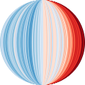 20210522 Warming stripes - longitudes - meridians on a globe - global warming.svg
 20210526 Warming stripes - hearts - global warming.svg
 20210507 Warming stripes - triangles - global warming.svg
 20210530 Warming stripes - diamonds - global warming.svg
 20210604 Warming stripes - XLSX to SVG - various Diamond etc configurations - GIF.gif
 20210507 Warming stripes - rectangles - global warming.svg
 20210517 Warming stripes - pentagrams - stars - global warming.svg
 20210508 Warming stripes - hexagons - global warming.svg
 20210507 Warming stripes - octagons - global warming.svg


